mockup-Macbook-Filter.png
 

CASE STUDY

Filter Digital Website

Filter is a consulting agency, outsourcing creative and technical expertise with a focus on resources for UX/UI, Visual Design, Multi-channel Campaigns, & Virtual Reality.

Armed with a new repositioning strategy to be more client-focused, Filter sought an overhaul for the next-generation of the agency website.


BG-Header-Filter_Gradient08_2560.png
 

My Involvement

I was hired as the sole UX & Visual Design consultant for the project, and contributed to each phase of the design process. I was responsible for building the wireframes, designing the graphic layout, UI, and illustrations.

I worked closely with Filter’s Marketing Director to fulfill the agency’s new initiative, and I presented concepts to the Filter stakeholders at key milestones. Also involved in the development phase, I assisted the developer with redlines, fine-tuned art direction, and production of assets.


UX DESIGN

wireframes
prototypes
developer specs

VISUAL DESIGN

layout & UI design
illustrations
brand style guide

TOOLS

Sketch
InVision
Photoshop
Illustrator
Squarespace

DURATION

6 weeks


Filter-BG-Banner-peach01-2560.png
 

UX Design


It’s said that “content is king”, and there was an abundance prepared ahead of my arrival to the project. However, the copy-heavy content risked overwhelming users, and thus would require me to make careful layout decisions to ensure the messaging is was scannable on all screen sizes.

My solution was to pace the content by establishing a visual hierarchy using thoughtful typography and a healthy dose negative space, then punctuate the UI with graphic elements such as helpful navigation, pull quotes, illustrations, and color.


WIREFRAMES

 
Banner_Header-lightGrey-2560.png
 

Concept Exploration


Moodboard.jpg
 

AN INSPIRED MOOD

Filter’s brand voice has always been full of personality—inspiringly fun, creative, yet ever professional. In contrast, the visual style was controlled, limited, and little to work with… an all-caps logotype using a single primary color.

I was granted complete creative freedom to art direct a visual style that expressed Filter’s unique personality. It was time to go bold, stand out, and be exciting!

In my exploration I sought contemporary visual trends that intuitively felt like an extension of Filter, and assembled them into a mood board of playful hues, graceful color transitions, and mod illustration styles. Selectively juxtaposed, an original voice began to emerge.


Banner_Header-lightGrey-2560.jpg
 

Visual Design


LAYOUT + UI DESIGN

When setting out to design a fearless aesthetic for Filter, I made sure to reference the mood board for visual inspiration and direction. To avoid relying solely on photography for the drama, I riffed on a myriad of hues and color transitions, and iterated until I found elements that played well together.

I had to make decisions quickly, as development began in tandem, and the developer was ready for design specs and production assets. We could fine-tune as we went.


STYLE GUIDE, AMPLIFIED


TYPOGRAPHY

The headlines took their cue from the Filter logo, the main paragraph style body copy balanced and crafted for legibility and texture, with measured italics added for accent.

 
BG-Banner-Filter_lighterGrey_2560.png


THE CASE FOR ILLUSTRATIONS v ICONS

To lead the user through the story, I needed to highlight key chapters using graphics, and I wanted to avoid resorting to icons. Inspired by elements found in exploration, I chose a mod geometric illustration style that would be easy to replicate and adapt.

CONS OF ICONS

  • overuse–too many points to highlight

  • cliché & unoriginal

  • many subjective, conflict in meaning

PROS OF GEOS

  • Relatively original context. Stand out from the norm.

  • Abstract geometric forms lended themselves very well to placing abstract concepts upon them

  • Many are optical illusions that convey a message of wonder and impossibility that design can overcome.

  • Large Variety and Very flexible. mix and match to communicate each type for each service


BG-Banner-Filter_lighterGrey_2560.png


Results

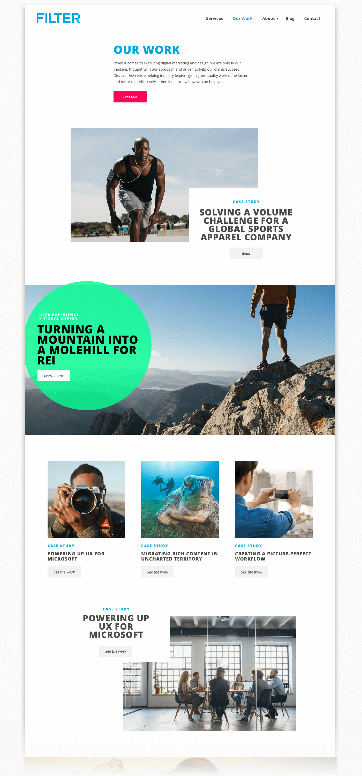
It was a very proud day when Filter Digital officially launched their new web presence, and were eager to flaunt their makeover through social channels.

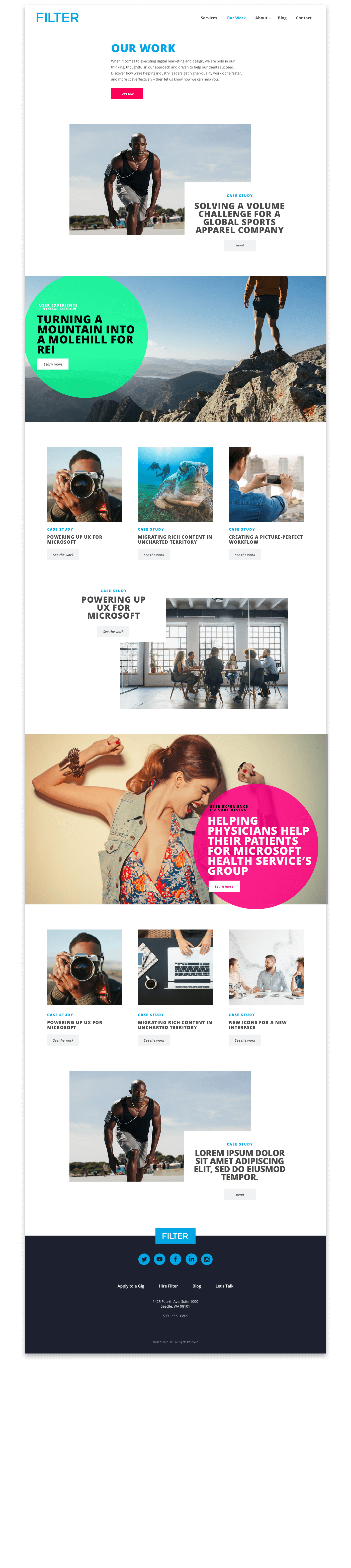
Sure, this agency now had fresh style, but the redesign most-importantly satisfied a new business strategy. Repositioned as client-focused, the response in client engagement was immediate and substantial, and resulted in building more managed teams, more ace-talent placed, and growth for the agency.

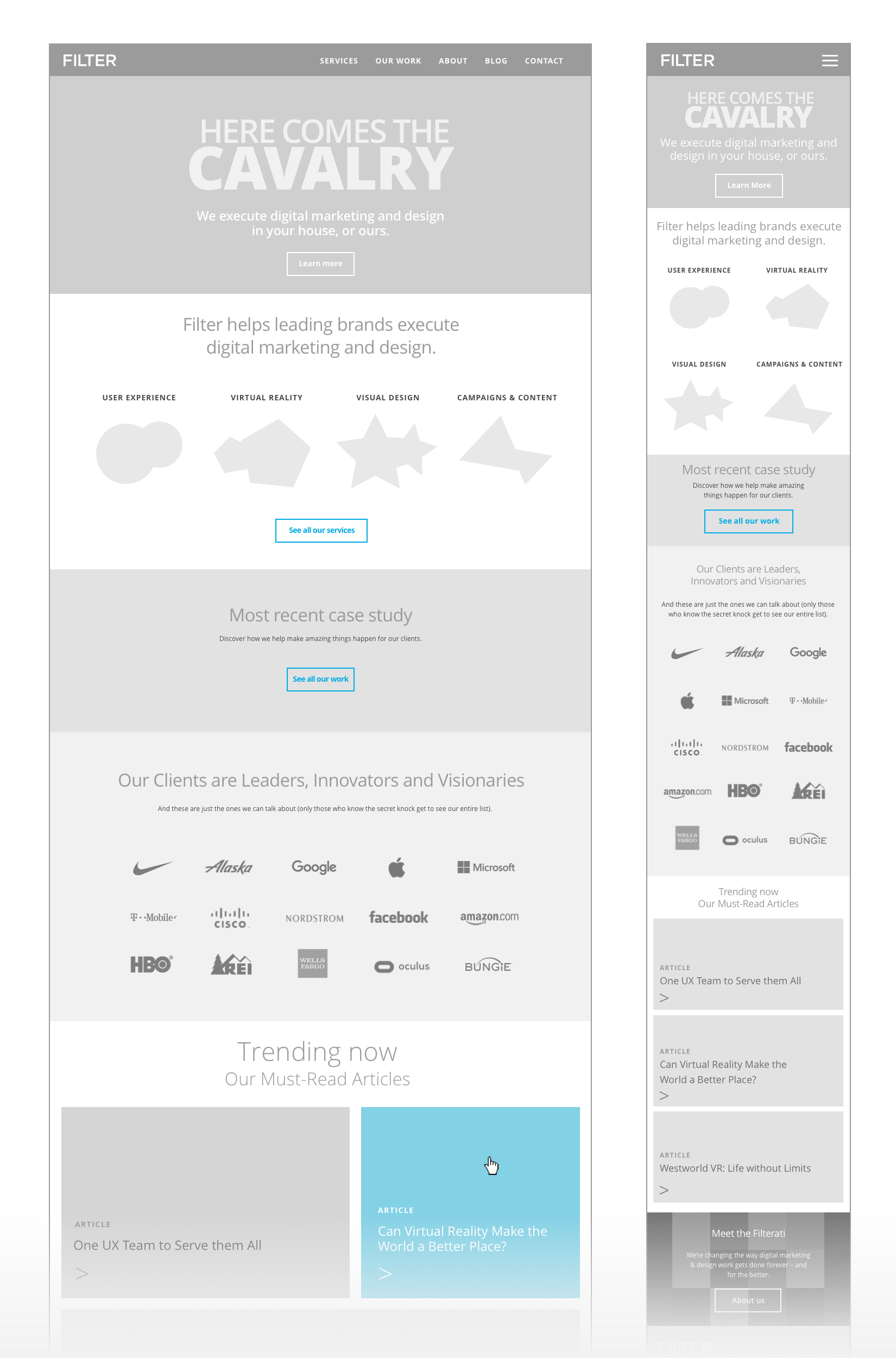
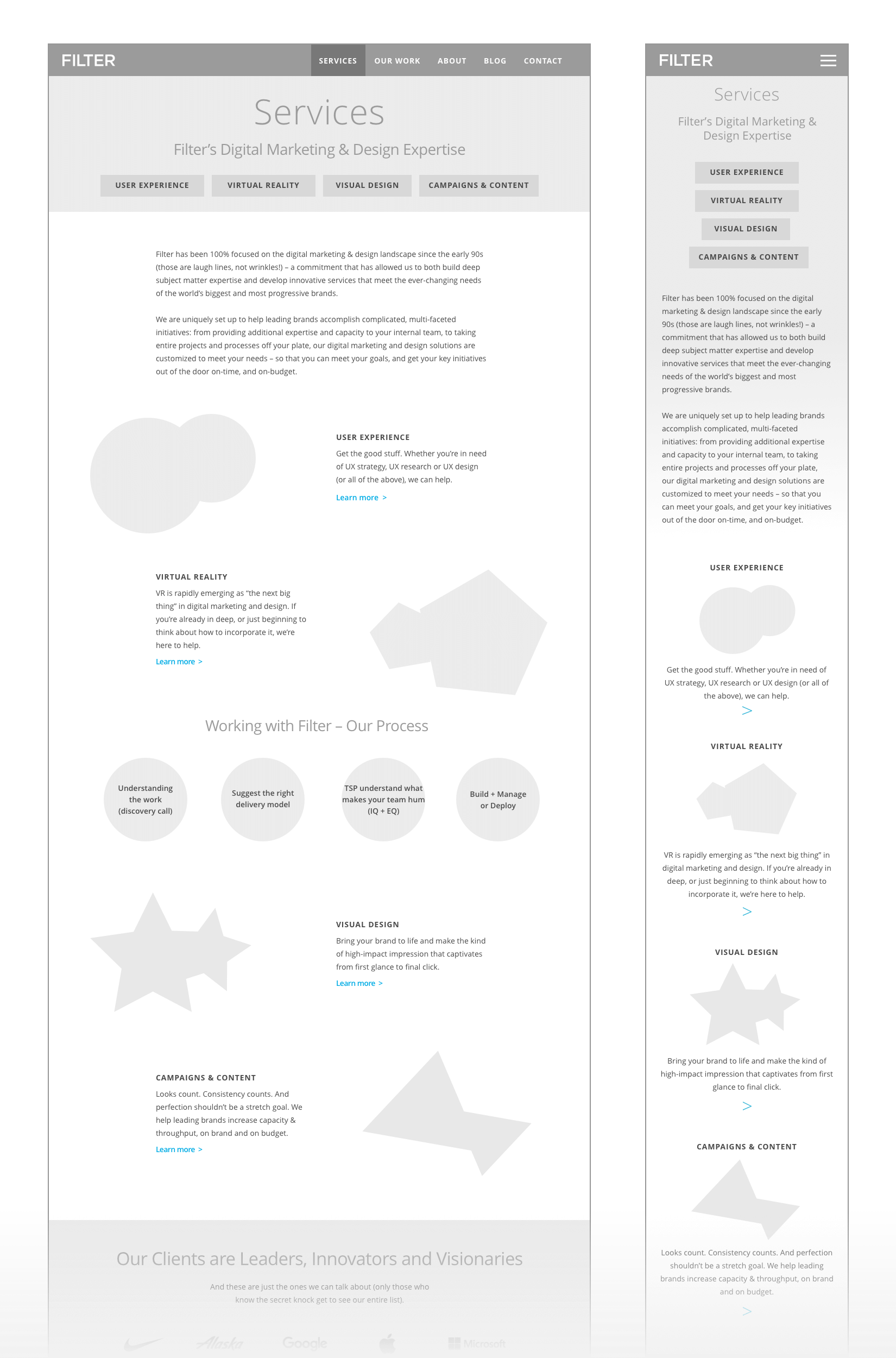
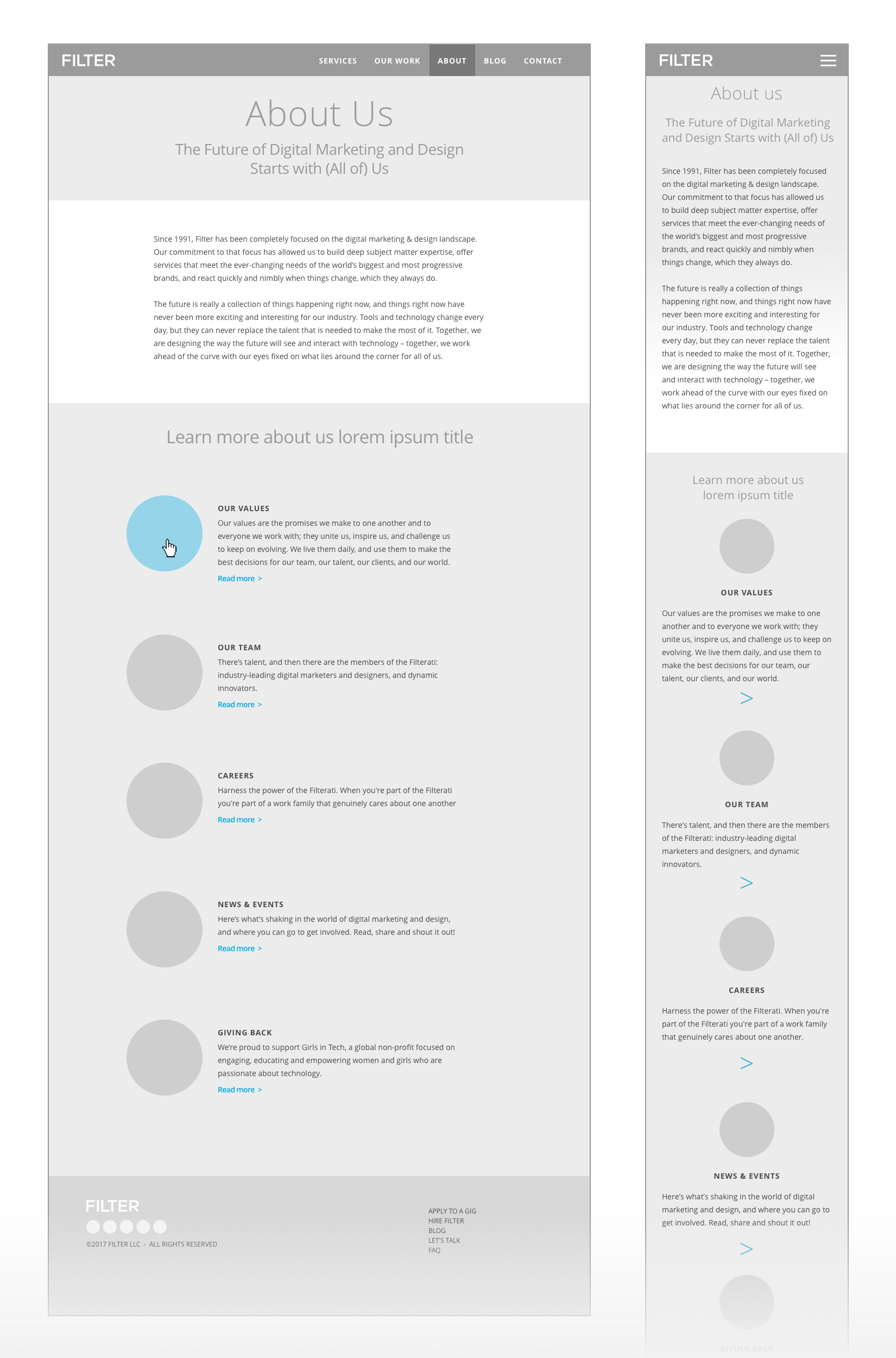
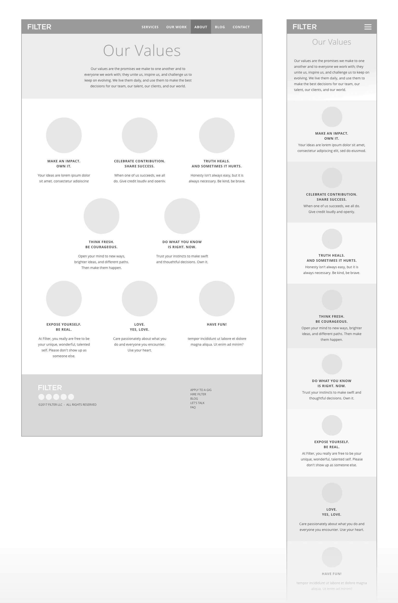
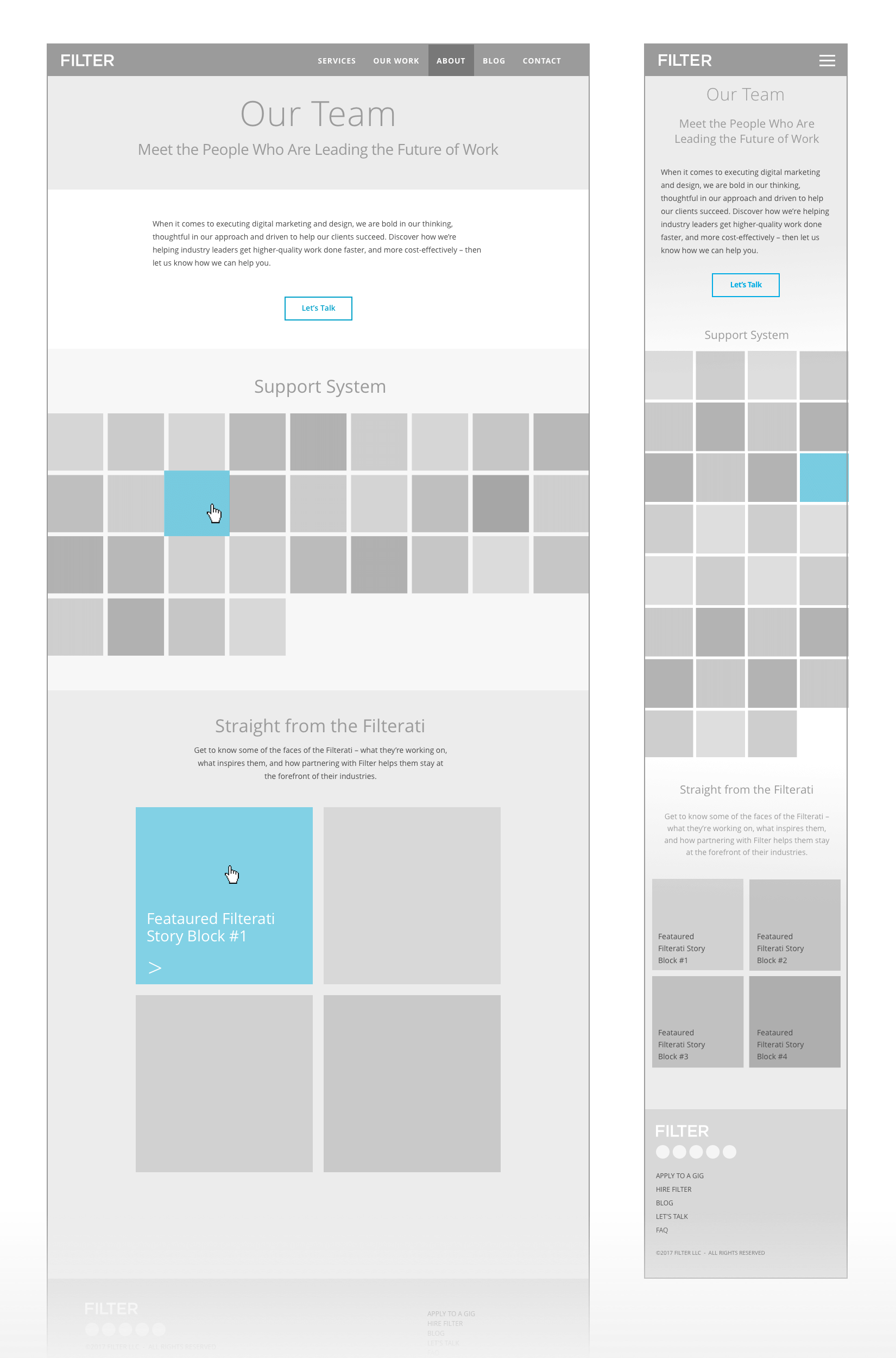
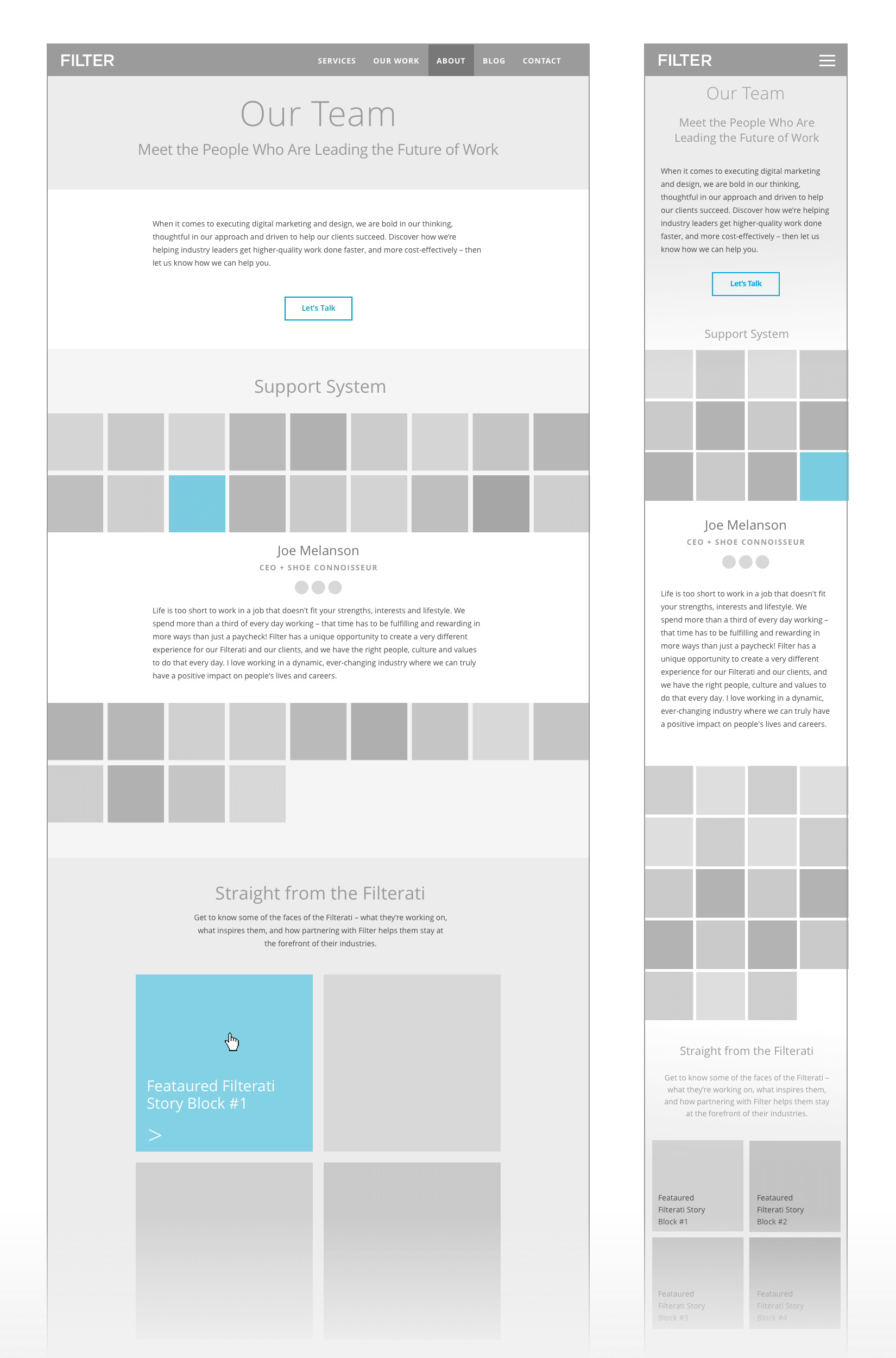
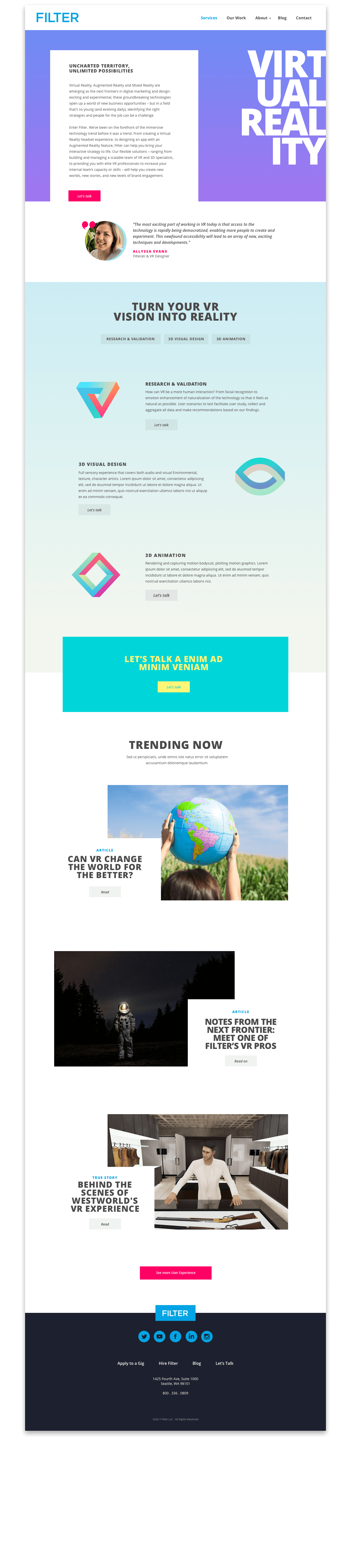
Practically speaking, the new website came with a functionality that was previously non-existent. They now had a CMS and an easily adaptable, flexible template to build and iterate upon, and a variety of graphic elements to assist in telling their story.

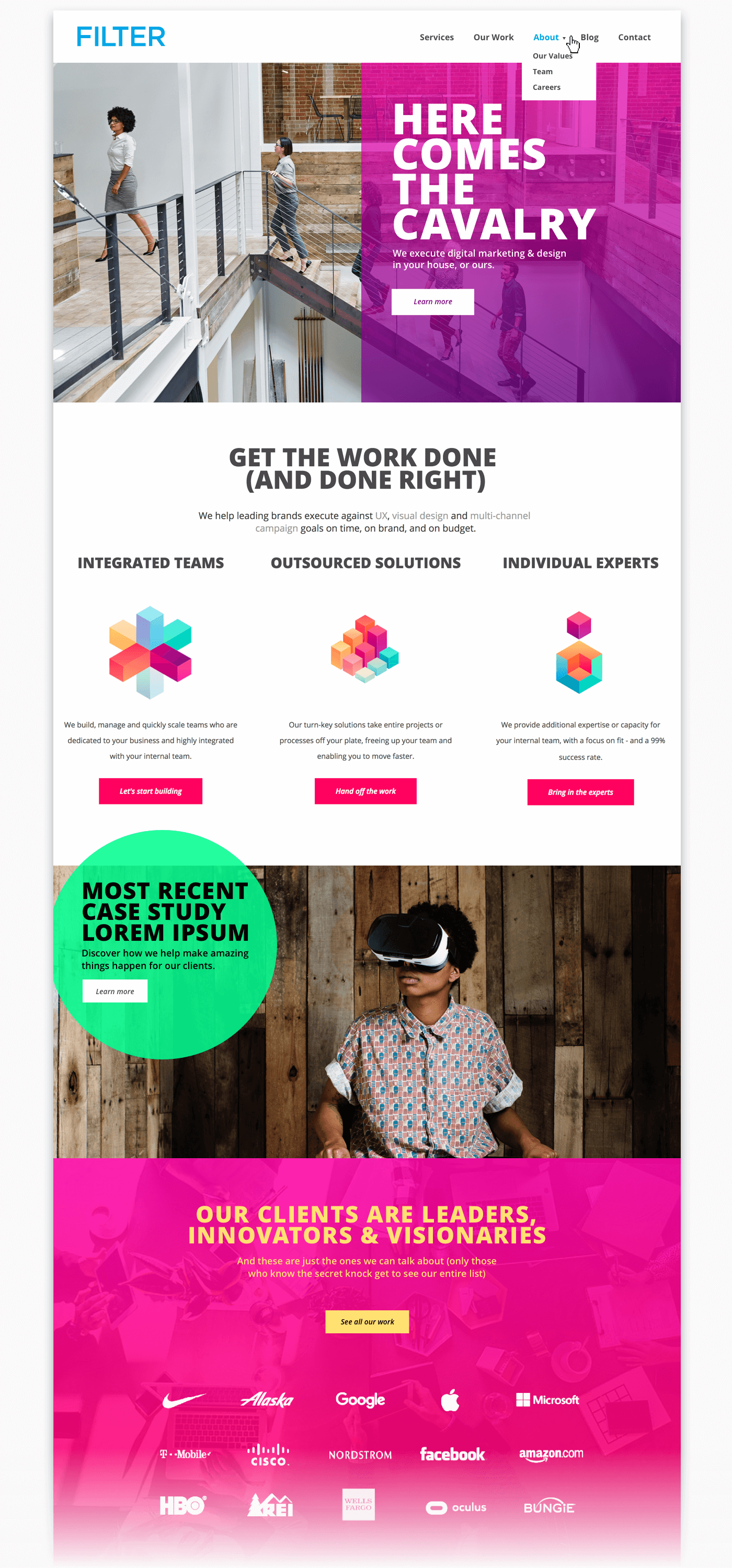
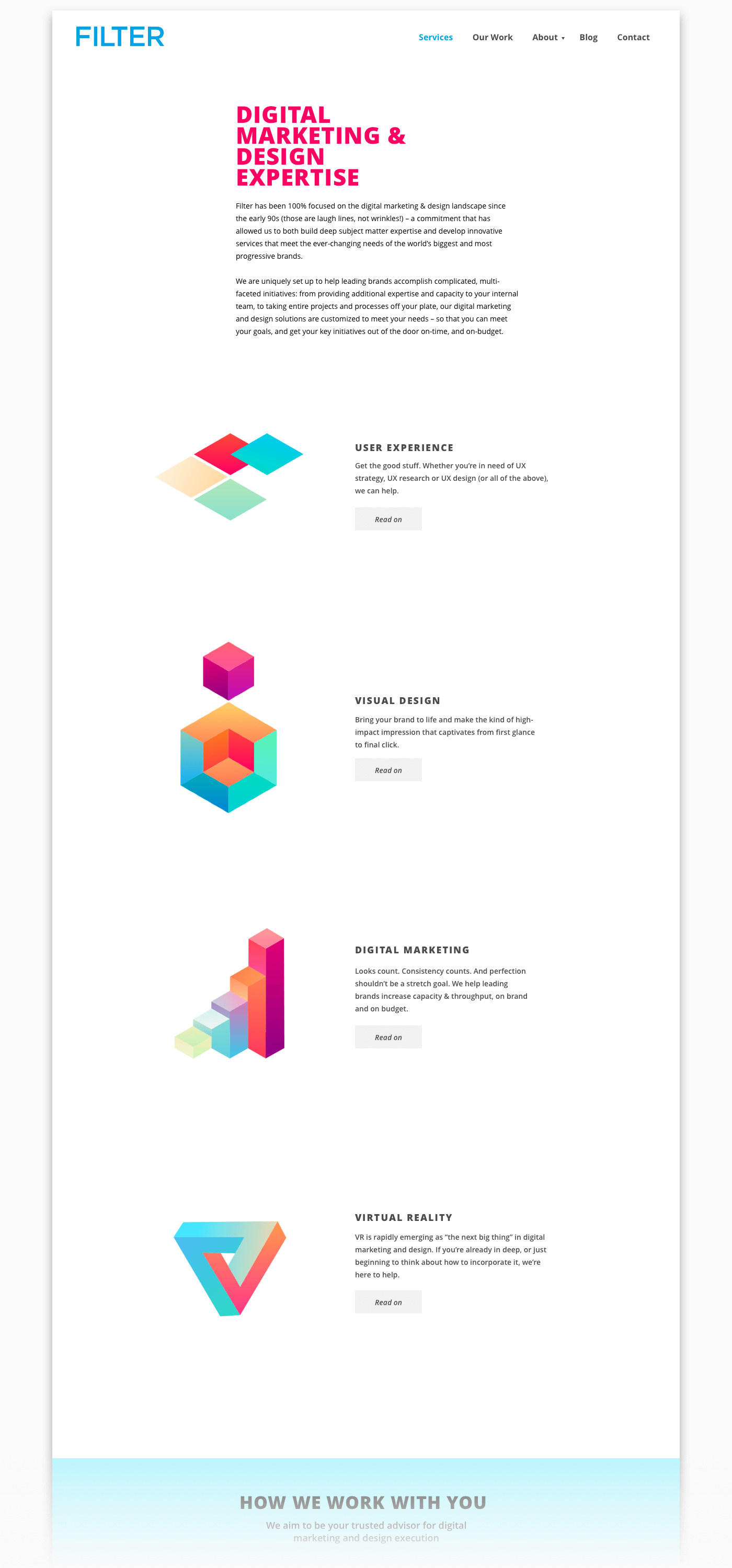
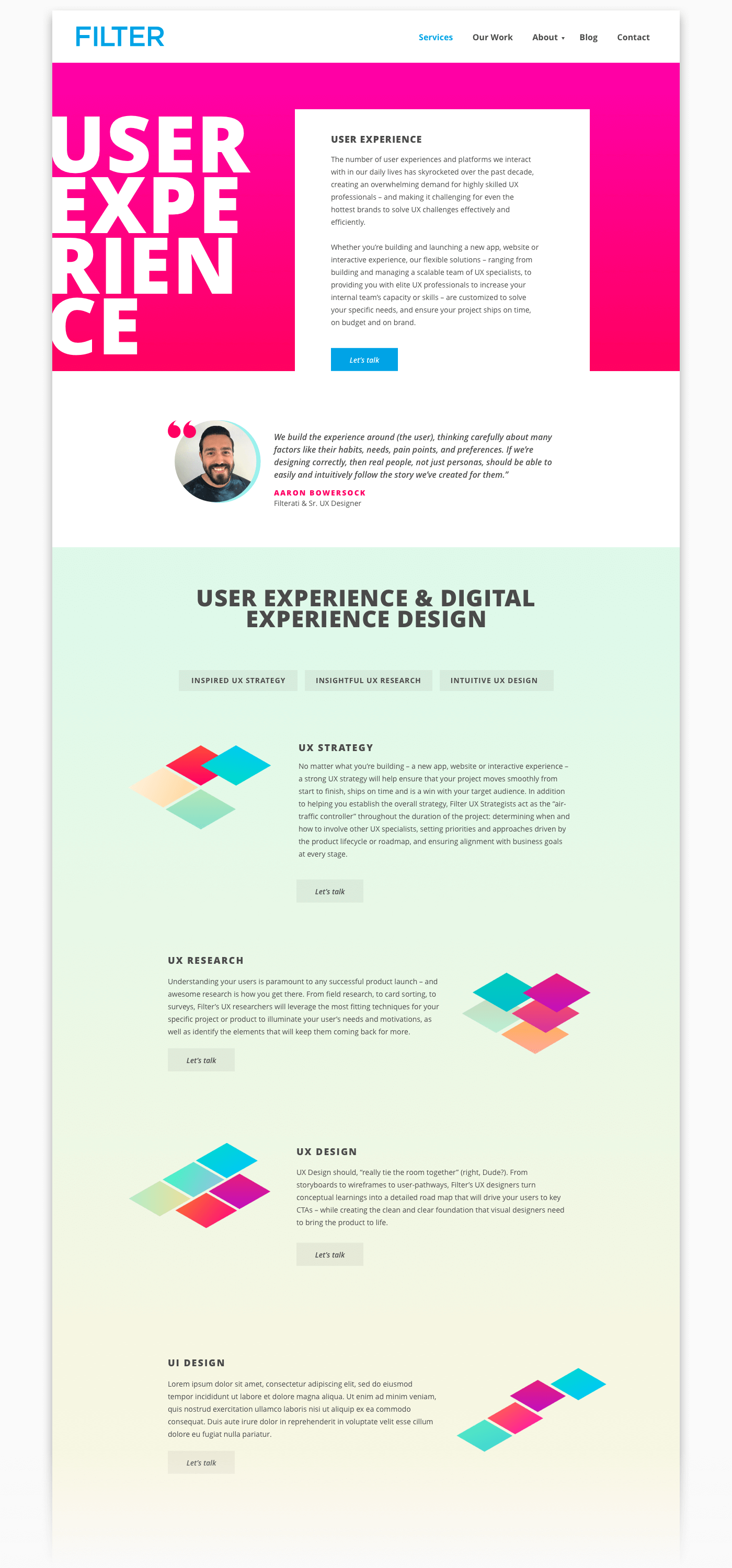
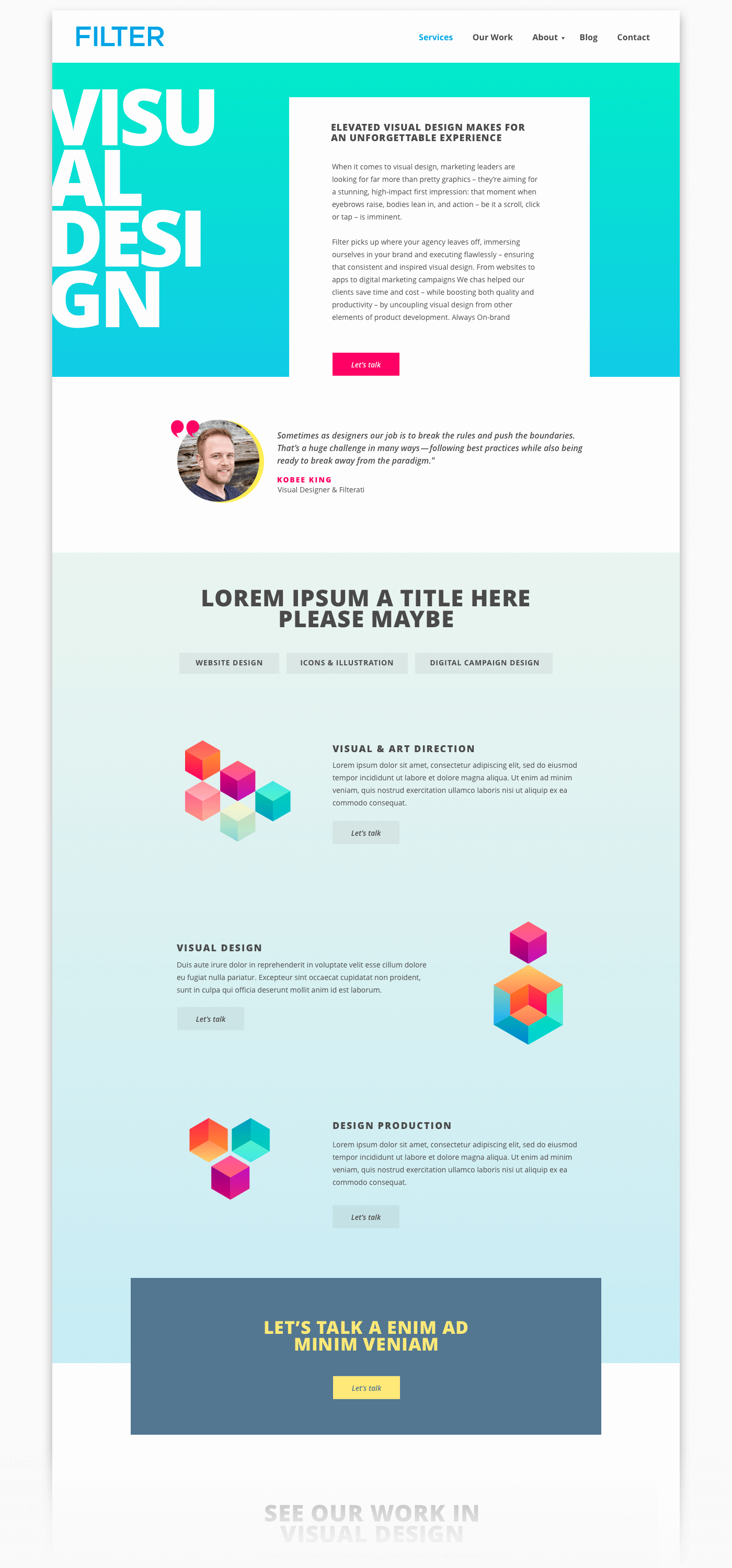
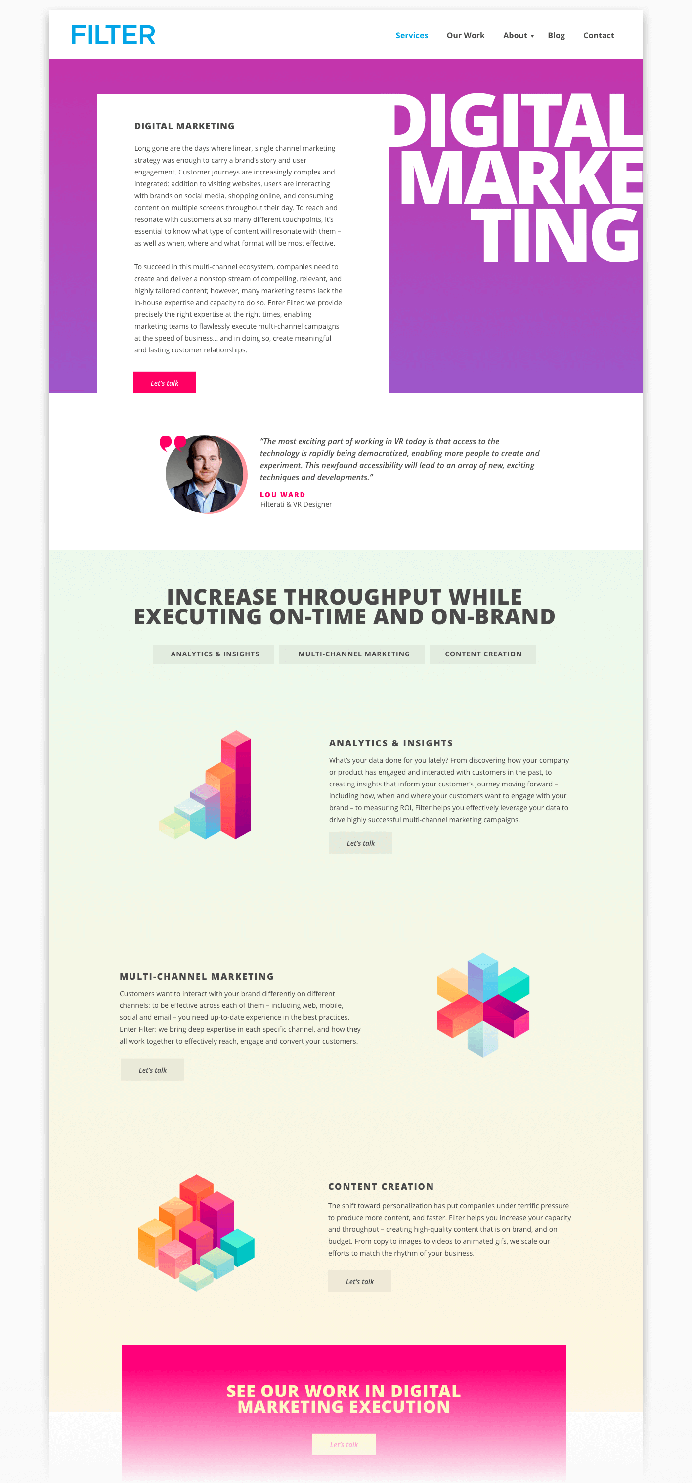
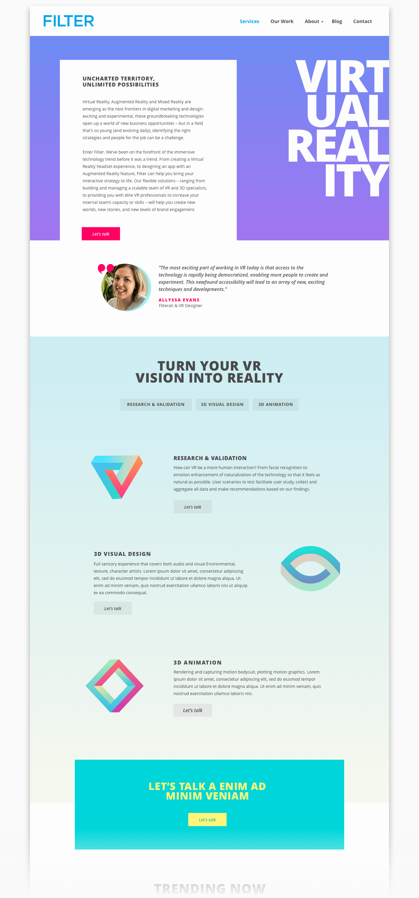
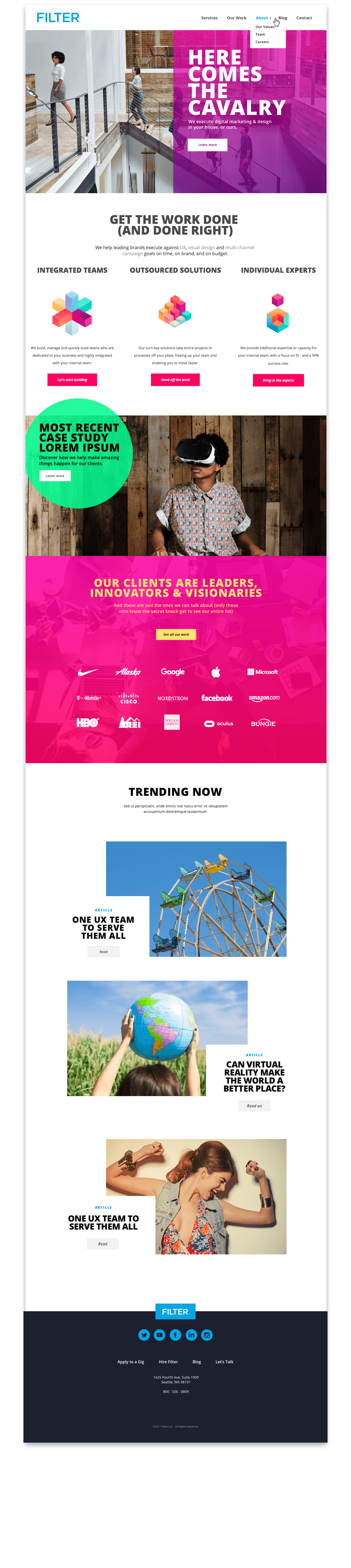
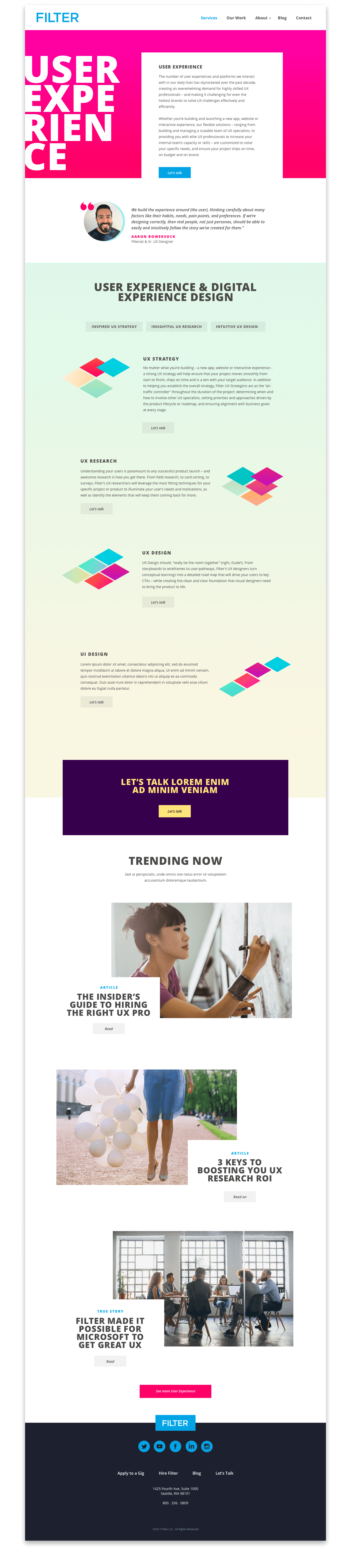
I made a significant contribution to the Filter brand. With design choices, evolved and expanded agency brand visual language, color palette & illustration set. Invigorated by the expanded brand colors and graphics, Filter updated their collateral and marketing materials, presentation decks, promotional communications and other collateral were redesigned to match.