Mockup-Microsoft.png
 

CASE STUDY

Microsoft Azure AI Platform

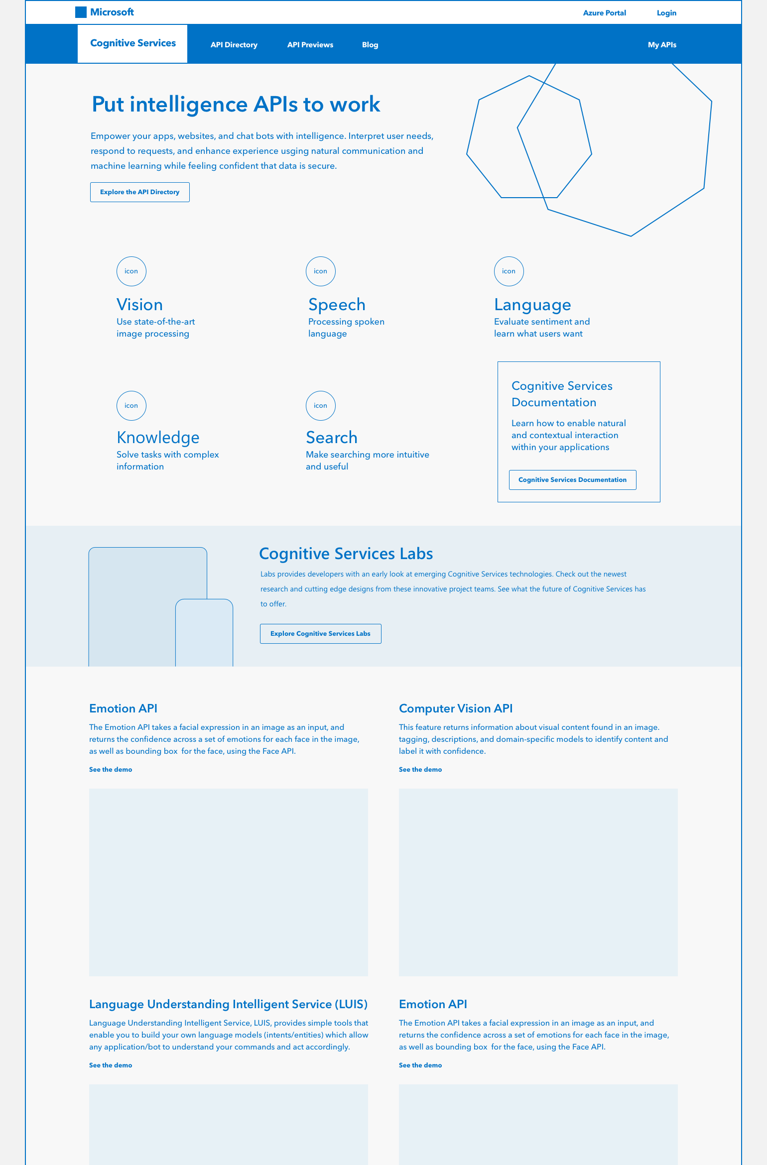
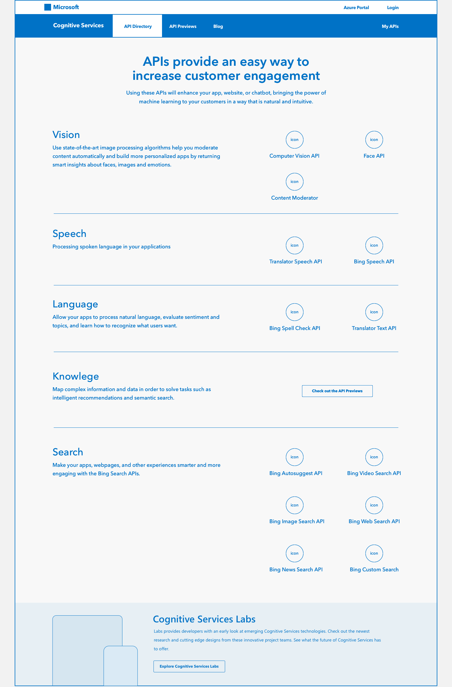
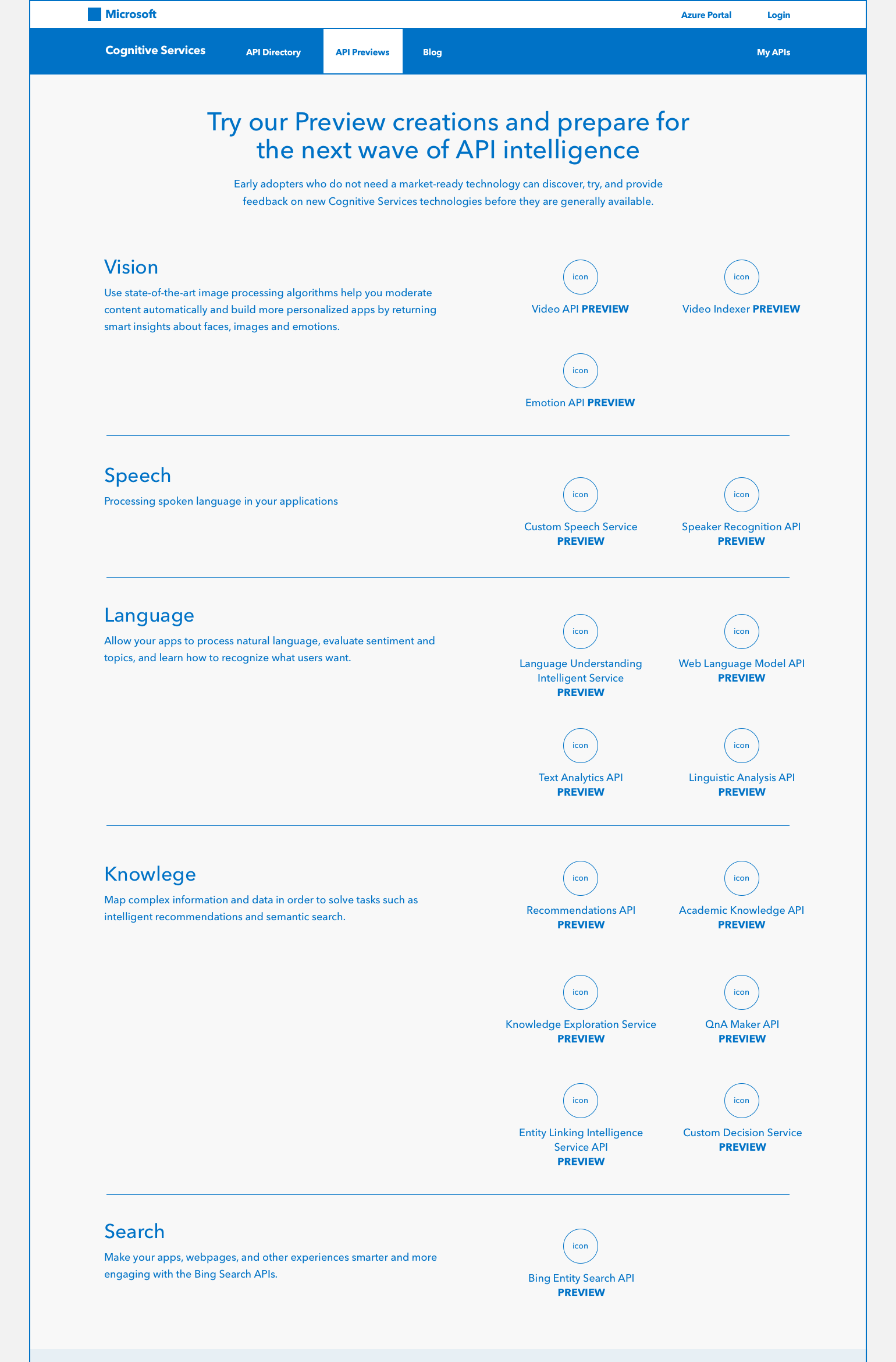
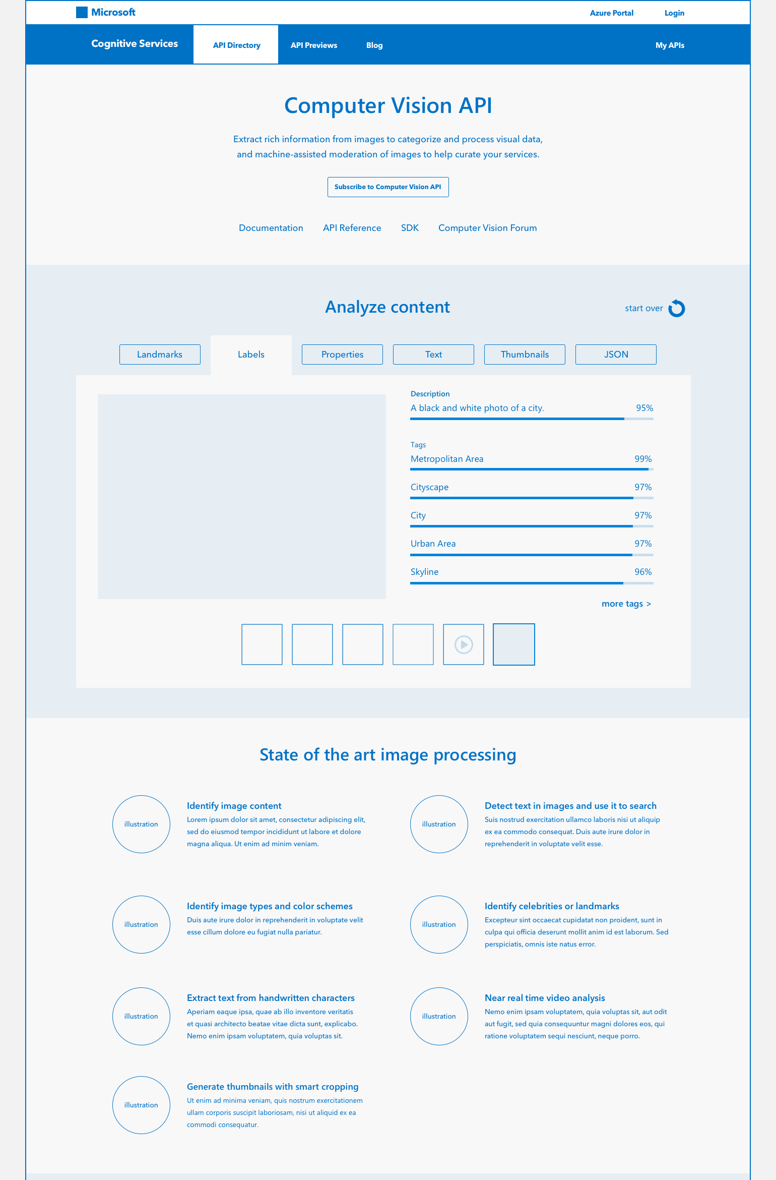
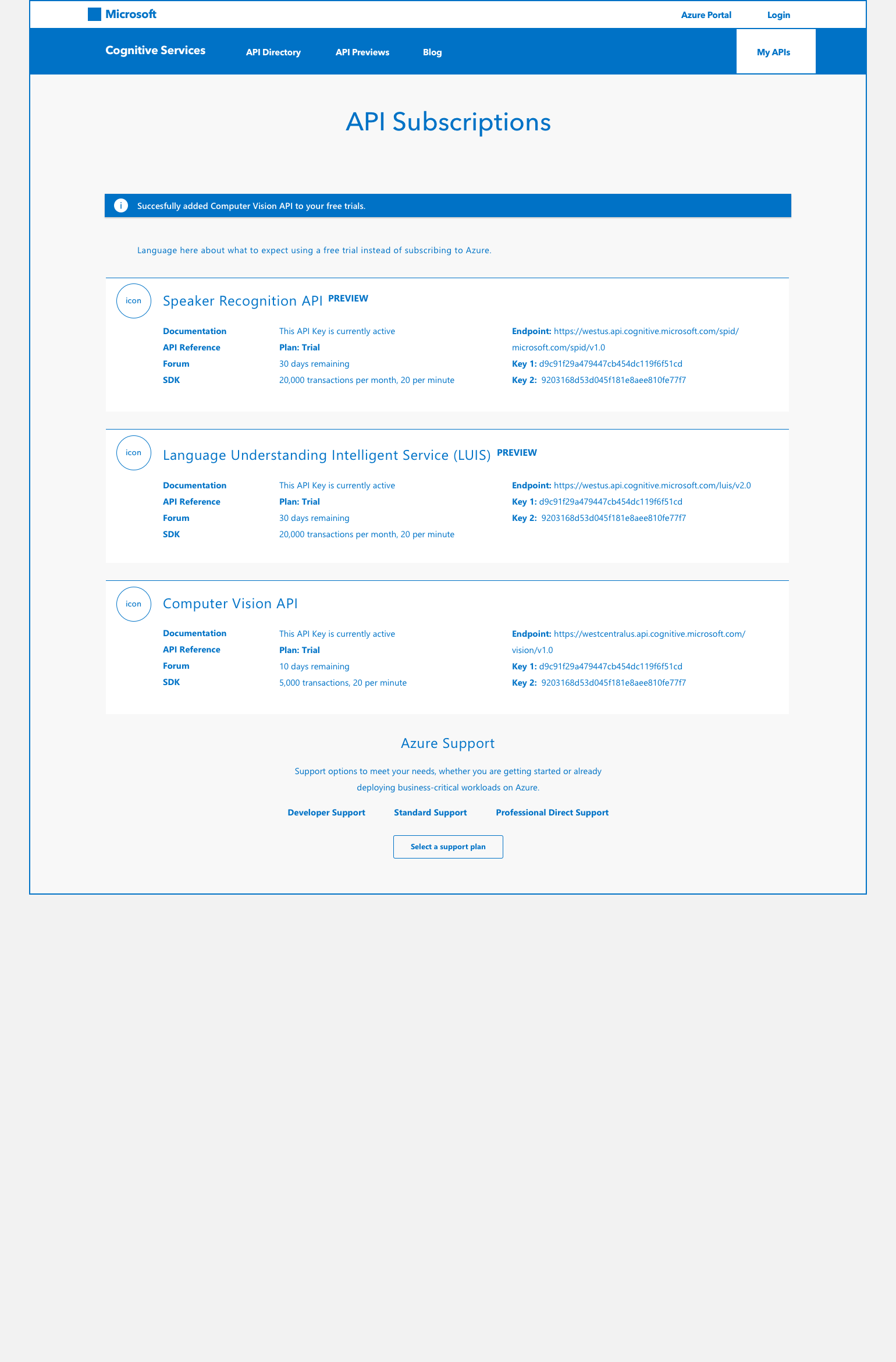
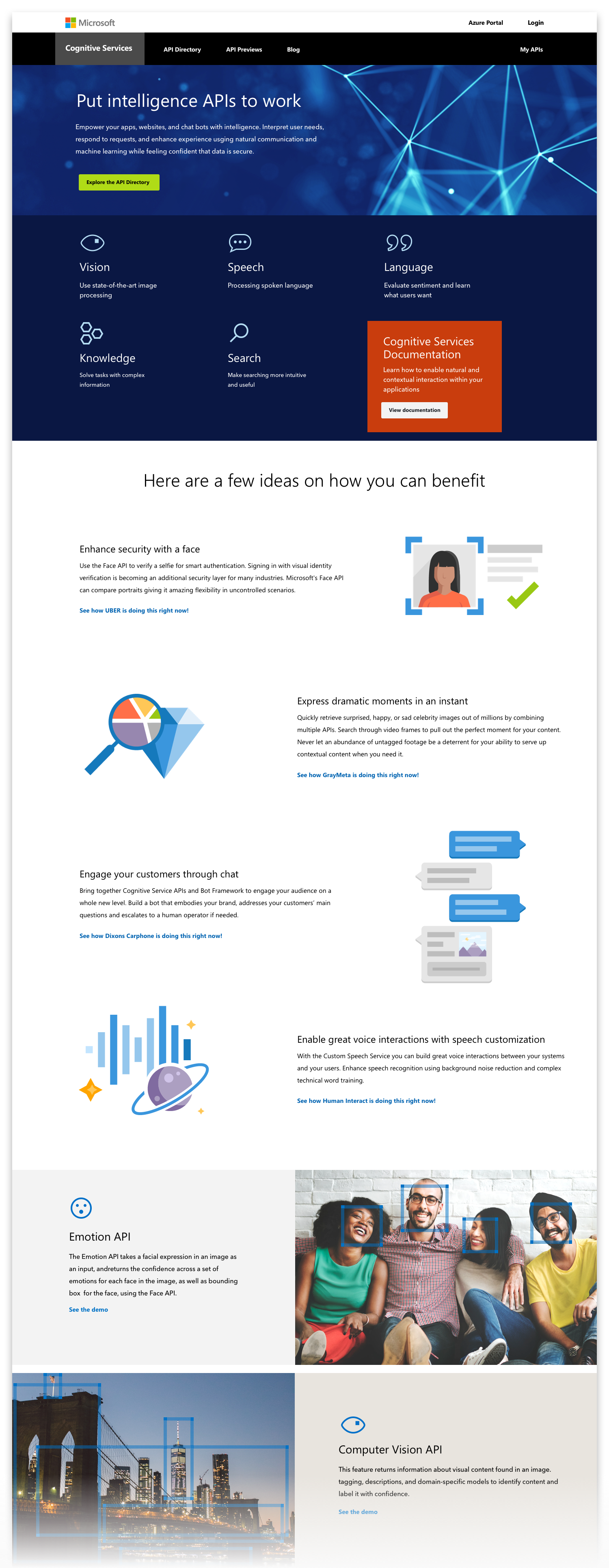
The Microsoft Cognitive Services are a suite of machine learning APIs and tools available to help developers build intelligent applications by easily adding cognitive features—such as emotion detection, speech recognition, and language understanding.

 
Banner_Header-BluBlueGrain-2560.png


Research

COMPETITIVE ANALYSIS

I began evaluating Microsoft’s API services by immersing myself in the content. I read the marketing pitches and tutorials, signed up for Azure AI services and those of their competitors, test-drove developer tools, and built a handful of bots and language models to gain deep industry insights on best practices, trends and offerings.

USER PROFILES & JOURNEY MAPS

I helped create a comprehensive competitive analysis and defined personas to ask key questions from varying perspectives. Then, I leveraged the personas to draw up user profiles and journey maps to best find and explain pain points. This enabled me to reframe them as opportunities for solutions.


Banner_Header-lightGrey-2560.png

UX Design


PROBLEM(S)

We navigated landing pages, subpages, documentation and demos, taking meticulous audit of the information architecture, user flow, UI patterns, and messaging. In short, we found the pages a tangled mess. One thing was clear though—the following issues led to a muddled user experience.

  • Architecture had become a patchwork of confusing, conflicting, even moving or disappearing menu items & CTA’s

  • Failing SEO ranking for Microsoft AI services routinely dropped behind competitor’s results, often pushed to subsequent pages.

  • UI referenced outdated, inconsistent style guides & pattern libraries.

  • Many icons & illustrations were not visually consistent in style, and often poorly communicated concept.

  • Messages rambled with an overuse of trendy jargon & confusing terminology, making it difficult for the user to find help and make informed decisions.

  • lengthy listed content impaired readability


RETHINKING THE CONTENT STRATEGY

I helped thoughtfully organize and edit content, with empathy for the needs of a diverse demographic of users (i.e. expert developers, directors, product managers, and dreamers), and created an inspiring and helpful user experience, while inherently repairing the SEO.

  • Simplified & reworded navigation elements to be intuitive, eliminated contradictions, & resolved dark patterns

  • Wrote engaging story in conversational voice and clear terminology

  • Characterized AI service features as inspired business solutions and Microsoft’s unique benefits with case studies

  • Found opportunities to supplement messages with helpful internal and external cross-linking to relevant content, useful information, documentation and reference material.

  • Integrated pacing elements such as pull quotes to retain a human element.


INFORMATION ARCHITECTURE & USER FLOW


WIREFRAMES & PROTOTYPES


BG-Beige.png

Visual Design


LAYOUT & UI DESIGN

Aligned with pattern library & style guide.

 
MS_styleGuide-03_DropdownInline.png
 

PROTOTYPES

We created an interactive prototype of key pages using Sketch App and InVision, and demonstrated the user journey to stakeholders.

 
Banner_Header-lightGrey-2560.png


API ICON SYSTEM

Each API service is branded with a unique icon, and appears throughout Microsoft AI tools, websites and apps. I found the original icons to be visually inconsistent as a family, and more importantly, many did not categorically communicate.

I took the initiative and proposed a refinement of the entire Cognitive Services API icon family. Every icon was crafted to be consistent in weight—and in many instances, replaced with an upgrade.

These icons appeared prominently across Microsoft Azure, and thus required the blessing from the Azure stakeholders.


API-Icons-allUp-1.png
API-Icons-allUp-2.png
 
 
BG-Beige.png


FEATURE ILLUSTRATIONS

New, original illustrations were needed to convey the many cutting-edge features of Microsoft’s machine-learning APIs.

They must fit visually within the Microsoft Azure brand guides of using geometric simplicity, color palette. I aimed to be original, communicate clearly, playful and witty—yet not cartoonish.

 
Illustration-CogServ-3up-1.png
Illustration-CogServ-3up-2.png
 
BG-Beige.png