HyperCommute

Google Visual Design Exercise

HyperCommute is luxury high-speed railway for commuters. My task was to design an “infotainment” experience passengers control from their mobile device, in which travelers request services, stay informed of their journey, and adjust cabin settings.

Why did I choose this design exercise?

This exercise allowed me the best opportunity to present my diverse skillset in both interactive and visual design skills.

DEVICE-HOME-01.png
 
 
HC-FOOD.png
HC-FOOD.png
HC-CABIN.png


Research & Exploration


Defining the scope
I was given roughly over two weeks to research, explore design options, and assemble a presentation of my design process. First things first, it is important to scope a timeline with milestones to keep on pace.

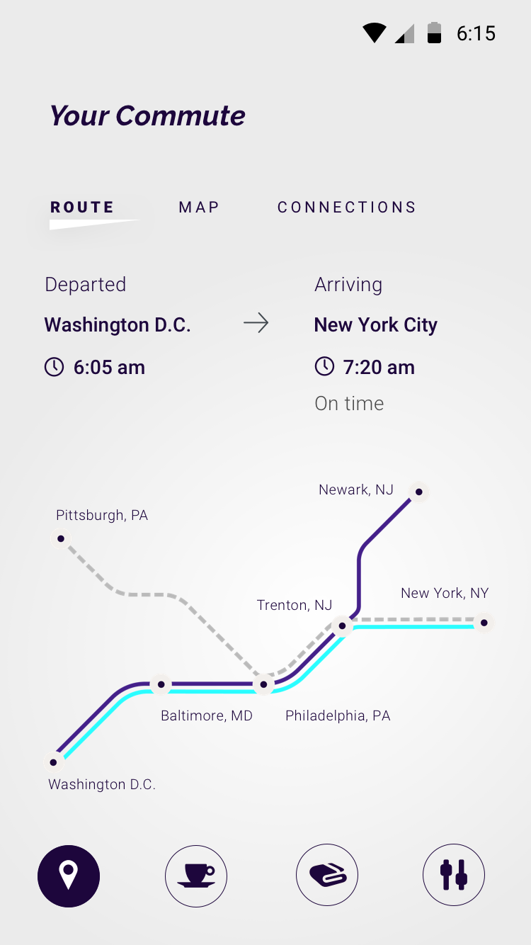
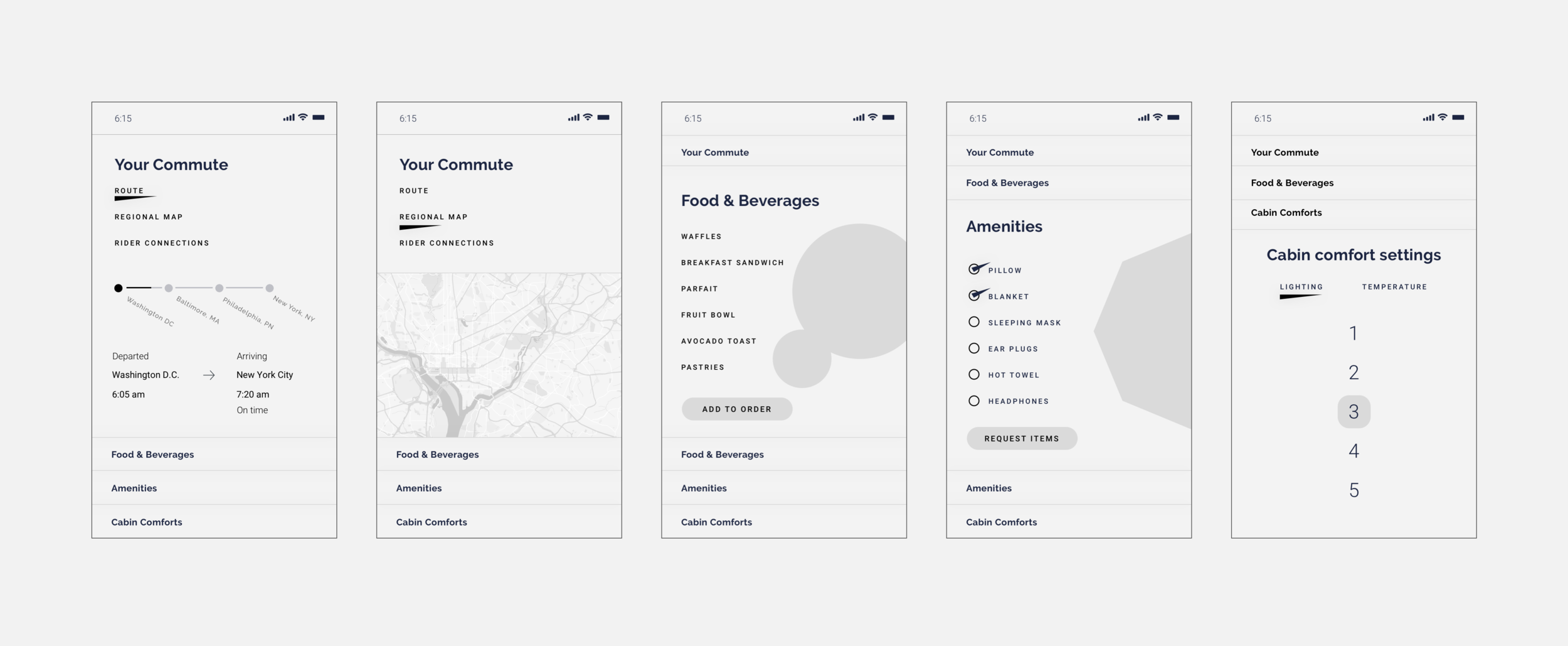
Tasked with designing a home screen and a detail screen of choice, I needed to understand what my (and more importantly the user’s) options are when navigating through this experience, and decide on a screen that will lend itself well to showcasing my craft of interactive visual design.

Setting a Timeline

  • Dec 13 | Design Prompts offered

  • Dec 14 – 21 | Select design exercise, research, gather content & inspiration, brainstorm

  • Dec 22 – 24 | User flows, exploration sketches & wireframes

  • Dec 26 – 28 | Explore visual language, hi-fidelity design (round 1), begin presentation

  • Dec 29 – 31 | High-fidelity designs (round 2 revisions), refine presentation

  • Jan 2 | High-fidelity designs (final)

  • Jan 3 – 4 | Finalize, publish & send presentation to Google

Research & Content Gathering ~2 hr

Before I could begin sketching layouts and explore the visual language, I needed to educate myself on high-speed transit technology that currently exists around the world, gather, curate and saturate myself with content about all things relating to the commuter lifestyle, and by rail and first-class business air travel.

  • Research the “competitor” landscape: high-speed rail technology already in use or being developed around the world. I considered examples such as California’s new high-speed rail development, Japan’s decades of experience, and Chinese and European adoption of luxury high-speed railways.

  • Referenced tangential industries that cater to business-class commuters, such as flying commercial airlines via business or first-class.

Brainstorming & Ideation Exploration ~1 hr

I often like to begin with a wordlist. It’s a fun and fast way to get fully immersed with all things in the industry, and surround myself in the concept. The goal is to put anything and everything in the list so I can curate a list of key words that define the unique benefits to focus on.

I’m able to conjure up words and concepts that get past the obvious, cliché or surface. In addition, I begin to see words or ideas that form unexpected forced connections. This process brings original ideas to the surface and provides inspiration.

 
word+listing.jpg

Key Words

sophistication
luxury
comfort
daily
ritual
commute(r)
rhythm(ic)
service
adjustment
information


Visual Exploration ~1 hr

Another inspiring and fast technique for getting immersed in the project is to gather visual reference of UI design and layout, interesting UX interactions, illustration styles, color palettes, etc. Similar to the word listing, it is a juxtaposition of all things tangentially related. And as before, I begin to see a common theme between otherwise non-related images.

Referencing my shortlist of keywords derived, I knew that “sophistication” was a defining attribute I aimed to stay close to. I also needed to find a visual language that would best lend itself to presenting my aesthetic craft.

In my exploration I found an illustration style that I imagined would both fit well within a layout and space for navigation, as well as work conceptually. However, as designing the layouts progressed, illustration wasn’t feeling “sophisticated” for details screens such as ordering food or amenities. I didn’t want this to become too icon-heavy either. I decided that the use of simple, appetizing photography would be classy and more appropriate for this application.

 
Research-Moodboard-s.jpg
 

Sketching: the art of sifting through ideas ~2 hr

Now that I’ve familiarized myself with the industry, curated a healthy amount of content to pull from, and found inspiration directions to aim for, it’s time to begin sketching out ideas for UX interactions, UI/layout possibilities and visual ideas. This is where I get a good feel of what the app is supposed to be, explore how the layout may or may not work, and even find ways to go way “out there” with some feature dreaming.

I kept the sketches loose on paper to get as many variations as I could, from the cliché to the daring.

 
Sketches-Adjusted2.jpg
 
 
BG-Beige.png
 

Wireframing

~4 hr

After sketching a variety of layout solutions, I had a feel for how to divide the content and what would allow for the best visuals possibilities.

I’m also still seeking which detail screen I will focus on. However, I felt that one screen wouldn’t be enough both to answer the original ask, and also didn’t allow me to fully show the breadth of my visual design skills and expertise.

I am exploring the space more accurately. While I had thought of an accordion-like menu in my sketches, I found it too wordy once I assembled it into the layout. I needed to simplify, and so I resided to a tried-and-true bottom nav using icons.

 
Wire-Header.png
BG-Beige.png


Visual Design Elements

Logo Design ~2 hr

While not the focus of the overall design, I needed to create a logo. I sketched some ideas out before ultimately having an ah-hah moment, seeing the two sides of the H also hint at perfectly parallel rail lines.


HC-Icons.png

Icons ~1.5 hr

At first I tried to avoid using icons. I wanted to explore other possible visual UI solutions, and make sure I wasn’t employing them as a crutch.

However, I needed to simplify the real estate the navigation was using. I resided to using simple icons sparingly, and assembled a set that is a decent first attempt given the time constraints.


Color Palette Explorations ~.5 hr

Referencing my initial visual exploration mood board, I had a general idea of a look and feel that I wanted to aim for.

After many subtle iterations, I settled on a combination of this bright yet classy palette, that yielded enough contrast for legibility.

After many subtle iterations, I settled on a combination of this bright yet classy palette, that yielded enough contrast for legibility.

COLOR-3.png


Map design iterations ~3 hr

In the first rounds of the design, when in the wireframe phase, I imagined a simple line graph with the stops. Then I remembered that this is an opportunity to showcase my visual strengths. After researching transit maps, I designed a quick, rough version that I could use in my layouts. I would come back later to detail. Just like the logo, this was a micro-project in itself, and it added a point of interest the overall app design.


Round 1 design

Round 1 design

A sketch placeholder based on idea

A sketch placeholder based on idea

Final Design after research and refining

Final Design after research and refining


Summary

Final Design ~8 hr


HC-HOME.png
HC-FOOD.png
HC-FOOD.png
HC-CABIN.png


I believe this represents a solid first round of design pitch. I had wanted to explore some illustration style and present my craft in that area, but it was omitted during the design process.


What would be the next design considerations, if there were a next phase in the design process?

  • Feedback from peers, testing & feedback. Refine, redesign, step and repeat.

  • I’d want to pay closer attention to UX best practices for navigation interactions, including accessibility concerns such as contrast for legibility.

  • Exploration of fun extras like A.R., A.I., V.R., Voice, or other cutting edge technologies.

What would you have designed differently?

  • I would have explored a wider variety of color palettes to consider.

  • I would have iterated lighting and temperature UX/UI controls.

  • A more original and refined set of icons for navigation


Thank you